Well Alteryx and Crowdstrike shares were hit as hard as Elastic as well, or harder. So why invest in Elastic with growing losses and promises of more, when you can invest in Alteryx or Crowdstrike (or Datadog) that are all hitting it out of the ballpark, and not trying to see how much money they can lose the way Elastic seems to be? That seems to me to be a valid question. It’s not like you are missing a bargain because Elastic is down. Crowd and Alteryx are down too, a lot, and have much, much better prospects for the next six months or a year, which is as far as we can really see with any kind of confidence.
It’s too much to expect that every stock discussed on Saul’s board is going to be a long time winner. Many have apparently good stories but something is holding them back. Most of us confess to not understanding the technologies. Even if we do, understanding the competitive landscape just adds to the complexity. Even a winner takes most like MDB is not necessarily the best performer “now.” Add to that Mr. Market’s moods and it gets really difficult if you are not in a bull market because only in bull markets are we all experts. I think the doubts expressed in this thread back up my contention.
At the risk of being OT I’m going to propose looking at charts. Not like chartists do with dozens of indicators but more like people looking at landscapes. In effect there are only three scenarios of interest, going up, down, or sideways. Forget gaps, support, resistance, etc. just look at the pretty pictures. BTW, traders usually prefer three and six month charts and I find them to be the most useful timeframes to detect Mr. Market’s moods but on occasion you want to look at different timeframes.
Before giving some examples, at another board we had long discussions about which was better, accumulating on the way down or waiting for the bottom and buying on positive momentum. Initially I was in favor of buying on the way down but I changed my mind, it’s safer to buy on the way up and looking at charts helps you make that decision.
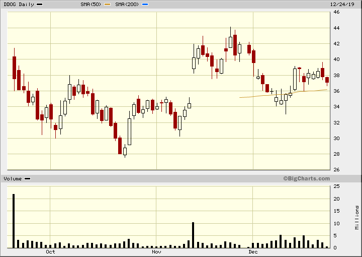
Here are six charts that I don’t like the looks of:
CRWD: https://softwaretimes.com/pics/crwd-12-24-2019.gif - can’t seem to get steam up
DDOG: https://softwaretimes.com/pics/ddog-12-24-2019.gif - in a trading range
ESTC: https://softwaretimes.com/pics/estc-12-24-2019.gif - down, down, down
MDB: https://softwaretimes.com/pics/mdb-12-24-2019.gif - after a nice run, in a trading range for 10 months
ZM: https://softwaretimes.com/pics/zm-12-24-2019.gif - down, down, down
ZS: https://softwaretimes.com/pics/zs-12-24-2019.gif - big gap down and indecision
Three charts that I do like
AYX: https://softwaretimes.com/pics/ayx-12-24-2019.gif - nice run up, corrections, and start of a new run
TLRA: https://softwaretimes.com/pics/tlra-12-24-2019.gif - it’s a turnaround so ignore the first half. Nice momentum
TTD: https://softwaretimes.com/pics/ttd-12-24-2019.gif - nice run up, corrections, and new run up
These charts are not the start of your research but after you have talked it all out, see if the chart agrees with you. Remember that in a bull run we are all geniuses which is the reason to buy on the way up.
I hope this was not too OT. Please, no chartist gobbledygook. Just look at the pretty pictures to see if they confirm or deny your conclusions.
Merry Xmas and a very Prosperous 2020!
Denny Schlesinger