Is there any meaning or significance of those tiny squares/flags tot he left of the Categories list? Is there a code or??
Just noticed, fixed that I had duplicated one of the categories, then noticed the duplicates had different flags, so they must not be a fixed or defined marker, just a mystery?
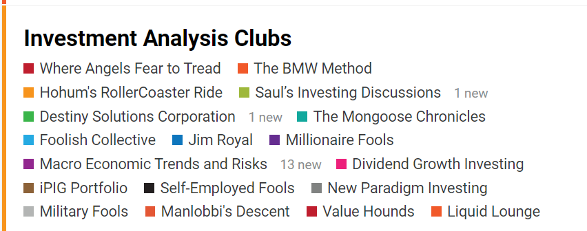
They match the category and sub-category color scheme from the home page. So if, you look there, you’ll see that the entire Investment Analysis Clubs bucket is light orange (vertical color to the left of it) and the sub-categories each have their own color - for example, METAR is light purple
Only so many colors in the theme to use - if the main category is the same color as a sub-category, they’ll appear solid - as in Hohum’s RollerCoaster Ride in the picture I provided.
This evening I noticed another oddity. In the Categories list to the left, they used to be alphabetical, a-z, top to bottom. Now they are scattered, fairly randomly listed instead…
They are actually now grouped in the same buckets they are in on the main page…so all the Personal Finance ones are together, all, the Investment Analysis Clubs are together, etc.
Well, maybe that makes sense to someone, but not anything in my many years of wanderings… With no user options, it seems we’re stuck with the scramble, other than maybe deleting the ones with little interest… Between the scrambled flagging, now scrambled Categories, are Tags the next to get the scrambled treatment? I see many good things, but still many random things that, to me are senseless… Thanks for your efforts to explain, but I see way too many negatives so far…
Sure. As if we’re going to memorize the helter skelter system the boards are organized in the first place, so we know what the tinyflags mean in the second place, so we can find a board in the third place.
Some coder somewhere is so far down the rabbit hole s/he thinks people are memorizing things and can make sense of this tilt-a-whirl organization scheme.
Personally I would suggest “alphabetical”, since most people know “alphabetical”. But then I’m one who would put boards in one place and stick to it, rather than have them jump all around, sometimes show up on a page and sometimes not. I do think the current system might work well for chickens who peck randomly and who don’t really care about where stuff is, if they find a kernel they’re happy, if not, peck again. But then chickens using an investing site are probably a fairly small audience, so…
That is about the most idiotic way of organizing things I can think of. Let’s get back to the things we learned in Kindergarten or first grade: The alphabet.
Mine goes from A-Z. Just like it did in first grade.
It switched on both my desktop and mobile. Not sure what’s going on here. I looked at the sidebar settings for something new, but didn’t notice anything new there.
Perhaps the recalcitrant hamsters from the old boards have taken up residence here.
Odd… Nothing changed for me, reloaded, looked at the Edit widget, and came back, still a scramble…Battery Technology should be up top, then Budget, Building, but they are scattered about in the middle, with Stocks A-Z up top… Didn’t see any options…
On my iPhone, the list of categories on the sidebar is alphabetical. And when I select a category that has unread or new posts, I get the “latest” view showing all of the topics in that category.
On my desktop, the list of categories in the sidebar is sorted in the silly way as discussed up thread, and when I select a category, I get only the unread or new posts. Changing the sidebar options doesn’t stick (and in fact, has somewhat different descriptions of the two options).
It would appear that the mobile view and the desktop view of this site have gotten out of sync and have gone awry.
Ahh, I haven’t messed with the site on my iPhone, only my desktop… I think it was alphabetical when I initially selected the Categories, then maybe the chaos set in… Between the random Flags, now the also random sorting, the only way to go is reduce the number of categories… I looked through them sometime over the weekend, most all had no postings for several days, a few went back to before the flip… Activity is nearly self generating it seems… We need PA, HURL, especially this week…
Yeah. I was thinking of an organization scheme where the order would be “Categories that start with A” followed by “Categories that start with B” and so on, through “Categories that start with Z”.
Then they’d always be somewhere where you can find them when you want, and you’d always know exactly where to look. I don’t know why my mind comes up with such unworkable schemes, I have to admit.